

Infographics from ACER's Teacher magazine.
-

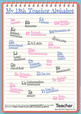
My 13th Teacher alphabet
Jo Earp
What do you need information on? Explicit instruction? Design thinking? Scientific literacy? Student anxiety? The 13th Teacher alphabet brings you quick links to popular content that you might find useful. Download the PDF for a hyperlinked version so you can access the content for each letter.
-

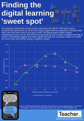
Infographic: Finding the digital learning ‘sweet spot’
Andrew Broadley
According to mathematics performance data from the OECD's PISA 2022 report, students that spend time at school learning on digital devices outperform students that don't. But how much time is too much time? In today’s infographic, we look at student mathematics scores across the OECD and Australia by hours spent on digital learning at school.
-

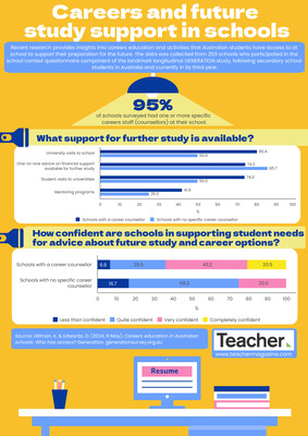
Infographic: Careers and future study support in schools
Dominique Russell
Recent research provides insights into careers education and activities that Australian students have access to at school to support their preparation for the future. The data was collected from 259 schools and in this infographic, we compare the findings for schools with a career counsellor and schools with no specific career counsellor.
-

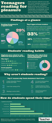
Infographic: Teenagers reading for pleasure
Max Hughes
A Deakin University study delves into secondary school students’ reading habits and explores the prevalence of reading for pleasure amongst teenagers. In this infographic we share some of the findings.
-

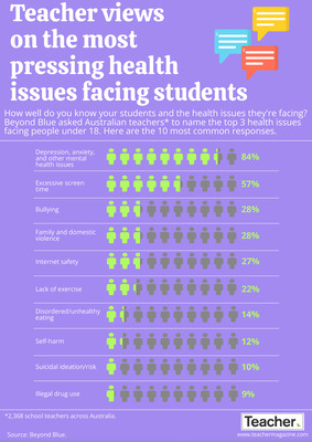
Infographic: Teacher views on issues facing students
Andrew Broadley
How well do you know the issues facing your students? Beyond Blue asked Australian teachers to name the top 3 health issues facing people under 18. In today’s infographic, we look at the 10 most common responses.
-

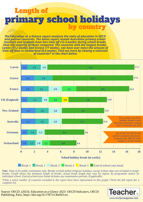
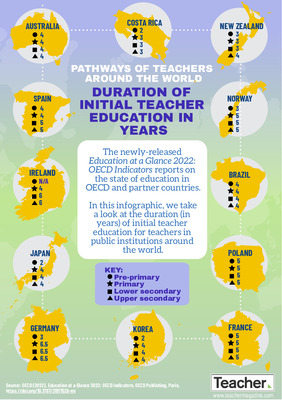
Infographic: Comparing the length of primary school breaks by country
Andrew Broadley
Do you feel like you’re getting enough time off each year? Recent data from the OECD’s Education at a Glace report reveals Australian primary school teachers and students have less time off each year than the majority of OECD countries measured.
-

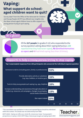
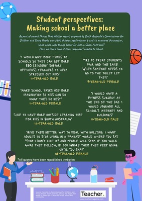
Infographic: What support do school-aged children want to quit vaping?
Dominique Russell
Survey data from the Office of the Advocate for Children and Young People has offered new insights into the ideas school-aged children have to offer support to a young person trying to quite vaping. Find out more in today’s infographic.
-

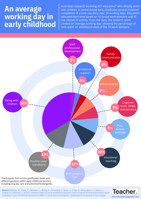
Infographic: An average working day in early childhood
Dominique Russell
Australian research involving 321 educators who directly work with children in centre-based early childhood services involved completion of a time use diary over 10 working days. From the data, the research team created an ‘average working day’, which we share in today’s infographic.
-

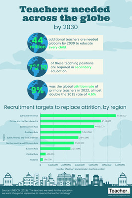
Infographic: Teachers needed across the globe by 2030
Dominique Russell
According to new research from UNESCO, 44 million additional teachers will be needed globally by 2030 to educate every child. In today’s infographic, we explore the key figures from this research, and share the recruitment targets for replacing attrition in primary and secondary schools.
-

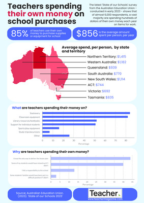
Infographic: Teachers spending their own money on school purchases
Dominique Russell
The latest 'State of our Schools' survey from the Australian Education Union - conducted in early 2023 - shows that of almost 6,000 respondents, a vast majority are spending hundreds of dollars of their own money each year on items for work.
-

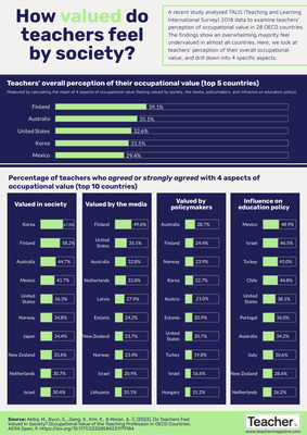
Infographic: How valued do teachers feel by society?
Dominique Russell
A recent study analysed TALIS (Teaching and Learning International Survey) 2018 data to examine teachers’ perception of occupational value in 28 OECD countries. The findings show an overwhelming majority feel undervalued in almost all countries. Here, we look at teachers’ perception of their overall occupational value, and drill down into 4 specific aspects.
-

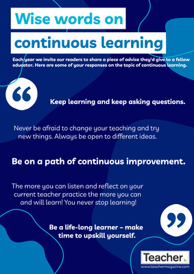
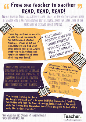
Infographic: Wise words on continuous learning
Dominique Russell
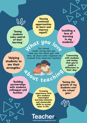
Our ninth annual reader survey recently concluded and in it, we invited you to share a piece of advice you'd give to a fellow educator. Here are some of your responses on the topic of continuous learning.
-

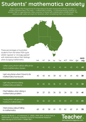
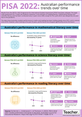
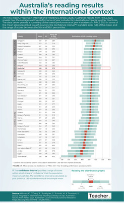
Infographic: PISA 2022 – Australian performance trends over time
Dominique Russell
Results from PISA 2022 have been released and the data show Australian student performance in maths and reading has been holding steady since 2015, and in science since 2018. However, when looking at the past 20 years, performance has dropped significantly across the board.
-

Infographic: My 12th Teacher alphabet
Jo Earp
What do you need information on? Technology in the classroom? Inclusivity? Making the most of your planning time? Music education? The 12th Teacher alphabet brings you quick links to popular content that you might find useful. Download the PDF for a hyperlinked version.
-

Infographic: Wise words on teacher workload
Dominique Russell
Our ninth annual reader survey recently concluded and many of you took the opportunity to let us know you’d like more support on managing teacher workload. You also shared some advice to your fellow educators on this very topic. In this infographic, we share some of those words of wisdom.
-

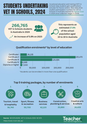
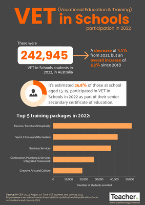
Infographic: VET in Schools participation in 2022
Dominique Russell
It’s estimated that almost 27% of those at school aged 15-19 participated in VET in Schools in 2022. In this infographic, we share the top 5 training packages in the 2022 school year.
-

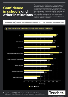
Infographic: Confidence in schools and other institutions
Jo Earp
The Attitudes towards education in Australia report from Australian National University includes data on public confidence in different institutions. Confidence in all institutions has declined since the height of the pandemic, with schools one of those to see a big dip. Find out more in this infographic.
-

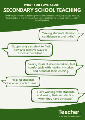
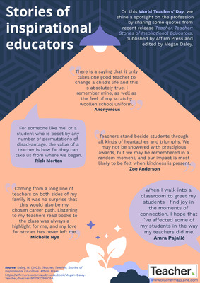
Infographic: World Teachers’ Day 2023 – Stories of inspirational educators
Dominique Russell and Jo Earp
On this World Teachers' Day, we shine a spotlight on the profession by sharing some quotes from recent release Teacher, Teacher: Stories of Inspirational Educators, published by Affirm Press and edited by Megan Daley.
-

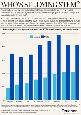
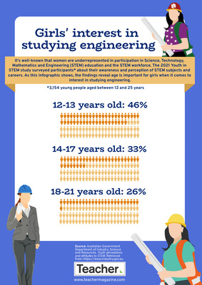
Infographic: Girls’ interest in engineering
Dominique Russell
It's well-known that women are underrepresented in participation in STEM education and the STEM workforce. The 2021 Youth in STEM study surveyed participants about their awareness and perception of STEM subjects and careers. As this infographic shows, the findings reveal age is important for girls when it comes to interest in studying engineering.
-

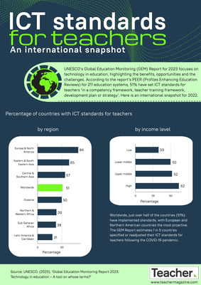
Infographic: ICT standards for teachers – an international snapshot
Jo Earp
UNESCO’s Global Education Monitoring Report for 2023 focuses on technology in education. According to the report’s Profiles Enhancing Education Reviews for 211 education systems, 51% have set ICT standards for teachers ‘in a competency framework, teacher training framework, development plan or strategy’. Here is an international snapshot for 2022.
-

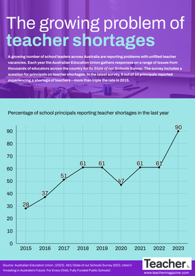
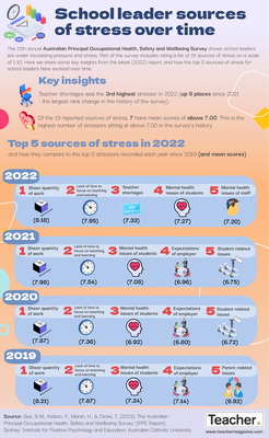
Infographic: The growing problem of teacher shortages
Jo Earp
A growing number of school leaders across Australia are reporting problems with unfilled teacher vacancies. The Australian Education Union’s annual ‘State of our Schools Survey’ includes a question for principals on teacher shortages. In the latest survey, 9 out of 10 principals reported experiencing a shortage of teachers in the last year – more than triple the rate in 2015. Find out more in this infographic.
-

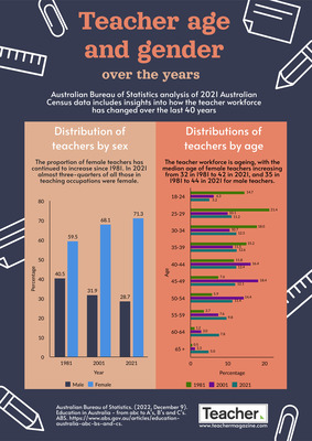
Infographic: Teacher age and gender over the years
Dominique Russell
Australian Bureau of Statistics analysis of 2021 Australian Census data includes insights into how the teacher workforce has changed over the last 40 years. In this infographic, we share how the distribution of teachers by age and sex has changed over the past 40 years.
-

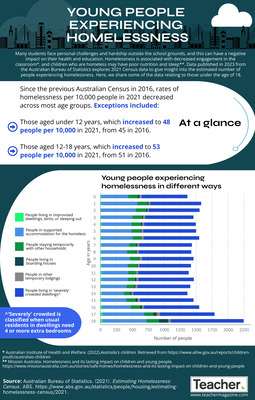
Infographic: Young people experiencing homelessness
Dominique Russell
Many students face personal challenges and hardship outside the school grounds, and this can have a negative impact on their health and education. Data published in 2023 explores 2021 Census data to give insight into the estimated number of people experiencing homelessness. Here, we share some of the data relating to those under the age of 18.
-

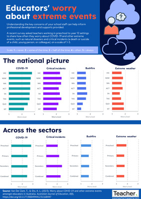
Infographic: Educators' worry about extreme events
Dominique Russell
Understanding the key concerns of your school staff can help inform professional development and supports provided. A recent survey asked teachers working in preschool to year 12 settings to share how often they worry about COVID-19 and other extreme events, such as natural disasters and critical incidents. Find out more in this infographic.
-

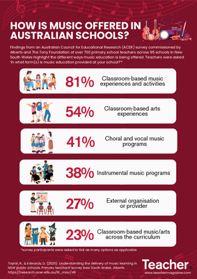
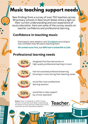
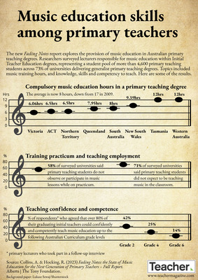
Infographic: Music education skills among primary teachers
Jo Earp
The new Fading Notes report explores the provision of music education in Australian primary teaching degrees. Researchers surveyed lecturers responsible for music education within Initial Teacher Education degrees, representing a student pool of more than 4,600 primary teaching students across 73% of universities delivering generalist primary teaching degrees. Topics included music training hours, and knowledge, skills and competency to teach. Here are some of the results.