

Infographics from ACER's Teacher magazine.
-

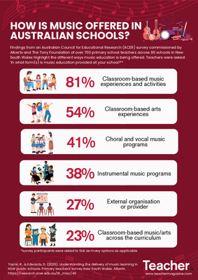
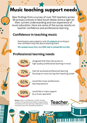
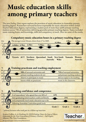
Infographic: Music education skills among primary teachers
Jo Earp
The new Fading Notes report explores the provision of music education in Australian primary teaching degrees. Researchers surveyed lecturers responsible for music education within Initial Teacher Education degrees, representing a student pool of more than 4,600 primary teaching students across 73% of universities delivering generalist primary teaching degrees. Topics included music training hours, and knowledge, skills and competency to teach. Here are some of the results.
-

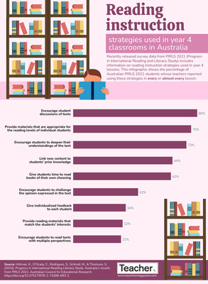
Infographic: Reading instruction strategies used in year 4 lessons in Australia
Dominique Russell
Recently released survey data from PIRLS 2021 (Progress in International Reading and Literacy Study) includes information on reading instruction strategies used in year 4 lessons. This infographic shows the percentage of Australian PIRLS 2021 students whose teachers reported using these strategies in every or almost every lesson.
-
")
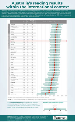
Infographic: Australia’s reading results within the international context
Australian Council for Educational Research (ACER)
The new report, Progress in International Reading Literacy Study: Australia’s results from PIRLS 2021, reveals how the average reading performance of year 4 students in Australia compares to other countries. Find out more in today’s infographic.
-

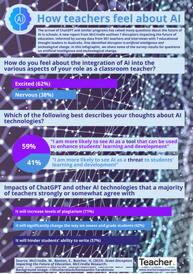
Infographic: How teachers feel about AI
Dominique Russell
A new report from McCrindle outlines 7 disruptors impacting the future of education, informed by survey data. One identified disruptor is artificial intelligence and technological change. In this infographic, we share some of the survey results for questions on artificial intelligence and technological change.
-

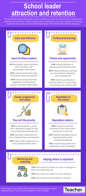
Infographic: School leader attraction and retention
Jo Earp
The Australian School Education Leaders Sentiment Index, by Slade Group, explores the priorities and drivers for school leaders when considering a new role. It draws on findings from interviews and a survey with 60 principals, from which 5 key themes emerged. Find out more in our latest infographic.
-

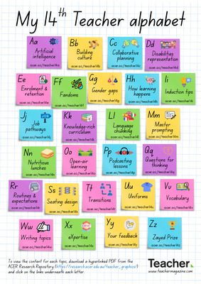
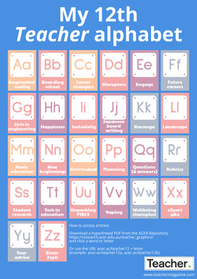
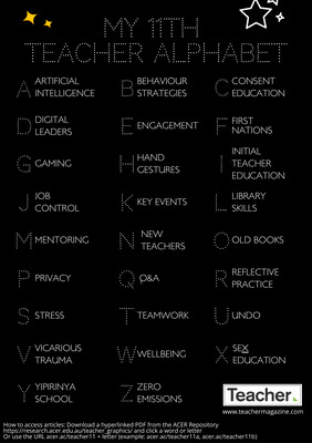
My 11th Teacher alphabet
Jo Earp
What do you need information on? Behaviour strategies? Embedding First Nations perspectives? Student engagement? Reflective practice? The 11th Teacher alphabet brings you quick links to popular content that you might find useful. Download the PDF for a hyperlinked version.
-

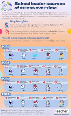
Infographic: School leader sources of stress over time
Dominique Russell
The 12th annual Australian Principal Occupational Health, Safety and Wellbeing Survey shows school leaders are under increasing pressure and stress. Here we share some key insights from the latest (2022) report, and how the top 5 sources of stress for school leaders have evolved over time.
-

Infographic: Secondary students, sex and relationships education
Jo Earp
The Australian National Survey of Secondary Students and Sexual Health explores young people’s experiences of sex, relationships, sexual health and school-based Relationships and Sexuality Education. Data from the seventh iteration, involving almost 7,000 participants, have just been released – in this infographic we look at some of the findings.
-

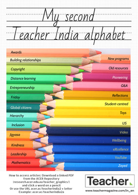
Infographic: My second Teacher India alphabet
Jo Earp
What do you need information on? School entrepreneurship programs? Global Citizenship Education? How to use toys to support learning? The second Teacher India alphabet brings you quick links to popular content that you might find useful. Download the PDF for a hyperlinked version.
-

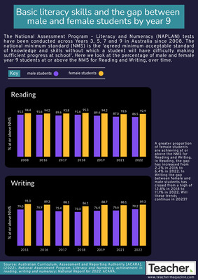
Infographic: Basic literacy skills and the gap between male and female students
Jo Earp
NAPLAN’s National Minimum Standard is the ‘agreed minimum acceptable standard of knowledge and skills without which a student will have difficulty making sufficient progress at school’. Ahead of the 2023 tests, we compare the percentage of male and female students in year 9 achieving at or above the standard in Literacy, over time.
-

Infographic: Basic skills and the gap between Indigenous and non-Indigenous students
Jo Earp
In the National Assessment Program — Literacy and Numeracy (NAPLAN) tests, the national minimum standard (NMS) is the ‘agreed minimum acceptable standard of knowledge and skills without which a student will have difficulty making sufficient progress at school’. This infographic looks at the performance of Indigenous and non-Indigenous students in Year 9, over time.
-

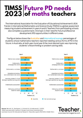
Infographic: Teachers’ requirements for ongoing professional development
Zoe Kaskamanidis
The newly-released Education at a Glance 2022: OECD Indicators reports on the state of education in OECD and partner countries. In this infographic, we take a look at professional development requirements for pre-primary, primary, upper-secondary and lower secondary teachers.
-

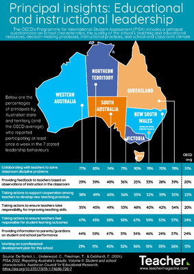
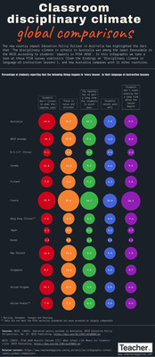
Infographic: Classroom disciplinary climate – global comparisons
Jo Earp
The new country report Education Policy Outlook in Australia has highlighted the fact that 'The disciplinary climate in schools in Australia was among the least favourable in the OECD according to students' reports in PISA 2018'. In this infographic we take a look at those PISA survey statistics, and how Australia compares with 11 other countries.
-

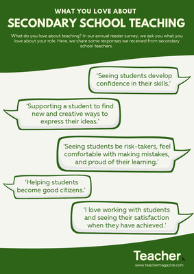
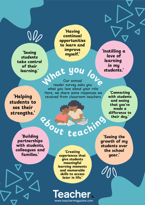
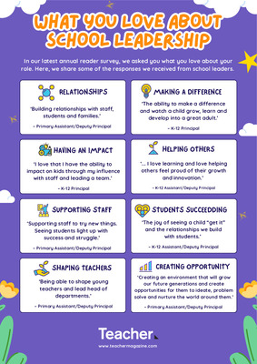
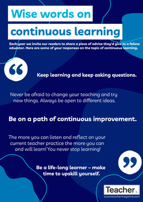
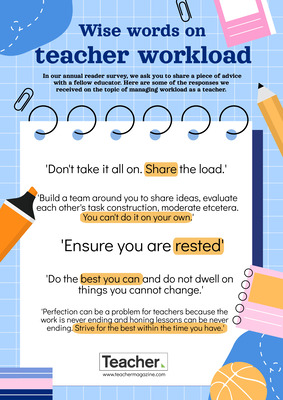
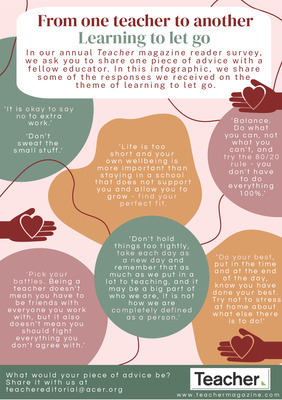
Infographic: From one teacher to another – learning to let go
Zoe Kaskamanidis
In our annual Teacher magazine reader survey, we ask you to share one piece of advice with a fellow educator. In this infographic, we share some of the responses we received on the theme of learning to let go.
-

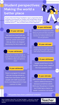
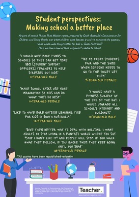
Infographic: Student perspectives on making school a better place
Dominique Russell
Almost 14,000 children aged 8-12 responded to the prompt, ‘the world would be better if…’ as part of a project run by South Australia’s Commissioner for Children and Young People. In this infographic, we share some of their responses.
-

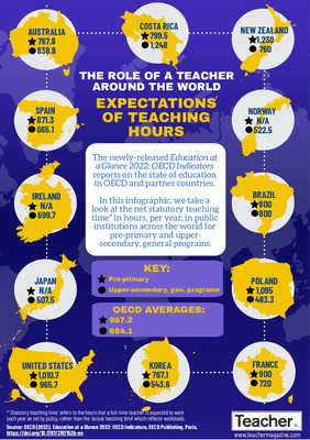
Infographic: Expectations of teaching hours
Zoe Kaskamanidis
The newly-released Education at a Glance 2022: OECD Indicators reports on the state of education in OECD and partner countries. In this infographic, we take a look at the net statutory teaching time in hours, per year, in public institutions across the world for pre-primary and upper-secondary, general programs.
-

Infographic: From one teacher to another – reflecting and connecting
Zoe Kaskamanidis
In our annual Teacher magazine reader survey, we ask you to share one piece of advice with a fellow educator. In this infographic, we share some of the responses we received from educators in India on the themes of reflecting and connecting.
-

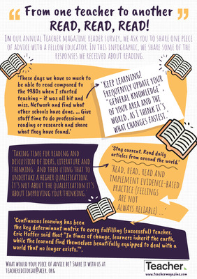
Infographic: From one teacher to another – read, read, read!
Zoe Kaskamanidis
In our annual Teacher magazine reader survey, we ask you to share one piece of advice with a fellow educator. In this infographic, we share some of the responses we received about reading.
-

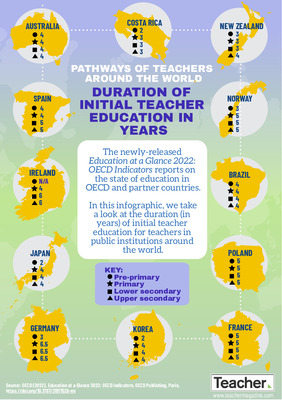
Infographic: Duration of initial teacher education in years
Zoe Kaskamanidis
The newly-released Education at a Glance 2022: OECD Indicators reports on the state of education in OECD and partner countries. In this infographic, we take a look at the duration (in years) of initial teacher education for teachers in public institutions around the world.
-

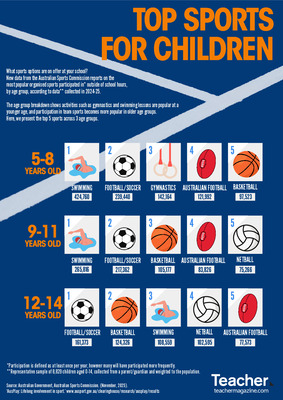
Infographic: Most popular sports for children over time
Dominique Russell
What sports does your school offer? Is there an overlap with the sports and activities students participate in outside school? Since 2015, Sport Australia has conducted AusPlay, a large-scale national survey tracking involvement in sport across the population, on an annual basis. In this infographic we compare the data on the top 10 sports (by participation rate in %) for girls and boys aged 0-14 to see how habits have changed over a 5-year period.
-

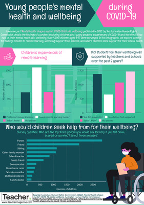
Infographic: Young people's mental health and wellbeing during COVID-19
Zoe Kaskamanidis
A new report from the Australian Human Rights Commission details the findings of a project exploring children and young people’s experiences of COVID-19. In this infographic, we explore some of the findings related to remote learning, wellbeing support from schools, and where children seek support for their mental health.
-

Infographic: Digital copyright laws and online teaching
Zoe Kaskamanidis
A new report has assessed whether copyright limitations for educational purposes are unfit for remote education through a legal analysis of copyright laws in 40 countries. This infographic shows the number of countries in the report for which the following online teaching scenarios are not legal.
-

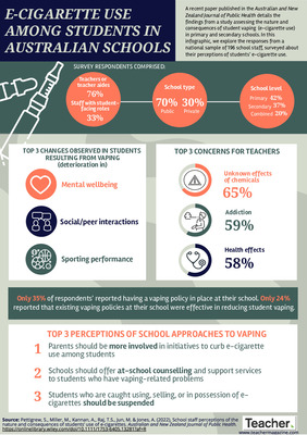
Infographic: E-cigarette use among students in Australian schools
Zoe Kaskamanidis
New research assesses the nature and consequences of student vaping in primary and secondary schools in Australia. In this infographic, we explore the responses from a national sample of 196 school staff, surveyed about their perceptions of students’ e-cigarette use.
-

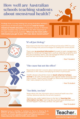
Infographic: How well are Australian schools teaching students about menstrual health?
Zoe Kaskamanidis
Findings from a cross-sectional survey looking into young Australian women’s experiences of menstruation and dysmenorrhea indicate the need for better menstrual health education in Australian schools. Find out more about the survey responses in relation to menstrual health in Australian Health and Physical Education in today’s infographic.
-

Infographic: Student perspectives – making schools a better place
Dominique Russell
Over 8300 children aged between 8 and 12 answered the question, 'what would make things better for kids in South Australia?' as part of an engagement project by the state’s Commissioner for Children and Young People. Here, we share some of their responses related to school.