

Infographics from ACER's Teacher magazine.
-

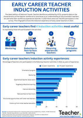
Infographic: Early career teacher induction activities
Dominique Russell
The latest edition of National Trends: Teacher Workforce published by AITSL presents data on the characteristics of the teacher workforce to contribute to an understanding of who Australia’s teachers are and what their workforce experiences look like. In 2023 there were over 50,000 participants in the survey. This infographic shows the induction experience of early career teachers in 2023.
-

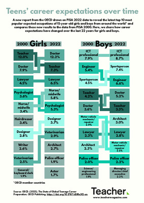
Infographic: Teens’ career expectations over time
Dominique Russell
A new report from the OECD draws on PISA 2022 data to reveal the top 10 most popular expected occupations of 15-year-old girls and boys from around the world and compares these new results to the data from PISA 2000. Here, we share how career expectations have changed over the last 22 years for girls and boys.
-

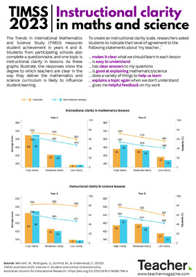
Infographic: TIMSS 2023 – Instructional clarity in maths and science
Jo Earp
Latest TIMSS data show the degree to which teachers are clear in the way they deliver the mathematics and science curriculum is likely to influence student learning. This includes ensuring students understand the learning goals for each lesson, being able to explain key concepts, and giving students helpful feedback. Find out more in this infographic.
-

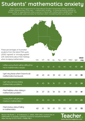
Infographic: PISA insights - students' mathematics anxiety
Dominique Russell
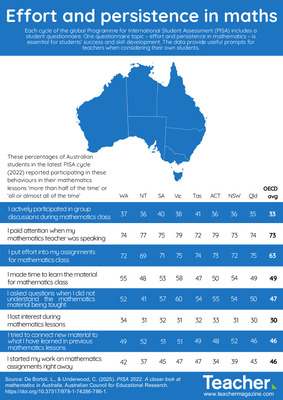
Each cycle of the Programme for International Student Assessment (PISA) includes a student questionnaire. One topic – mathematics anxiety – is characterised by feelings of tension, fear or apprehension when a person is faced with mathematics-related tasks. Today’s infographic provides useful prompts for teachers when considering their own students.
-

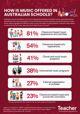
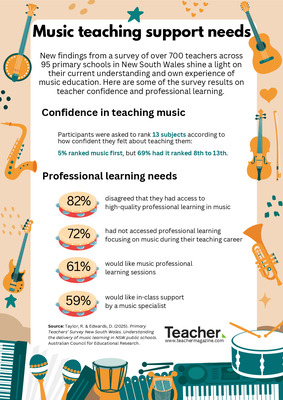
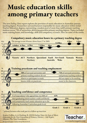
Infographic: Music teaching support needs
Dominique Russell
New findings from a survey of over 700 teachers across 95 primary schools in New South Wales shine a light on their current understanding and own experience of music education. Here are some of the survey results on teacher confidence and professional learning.
-

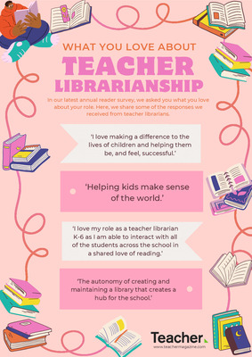
Infographic: What you love about teacher librarianship
Dominique Russell
In our latest annual reader survey, we asked you what you love about your role. In this infographic, we share some of the responses we received from teacher librarians.
-

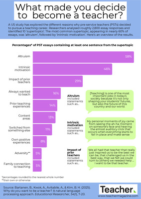
Infographic: What made you decide to become a teacher?
Jo Earp
A US study has explored the different reasons why pre-service teachers (PSTs) decided to pursue a teaching career. Researchers analysed roughly 2,800 essay responses and identified 10 ‘supertopics’. The most common supertopic, appearing in nearly 60% of essays, was ’altruism’, followed by ‘intrinsic motivation’. This infographic gives an overview of the results.
-

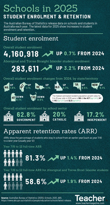
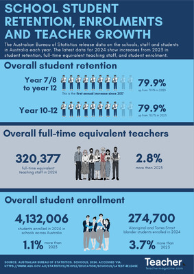
Infographic: School student retention, enrolments and teacher growth
Dominique Russell
The Australian Bureau of Statistics release data on schools, staff and students in Australia each year. The latest data for 2024 show increases from 2023 in student retention, full-time equivalent teaching staff, and student enrolment.
-

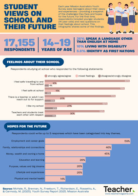
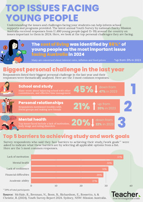
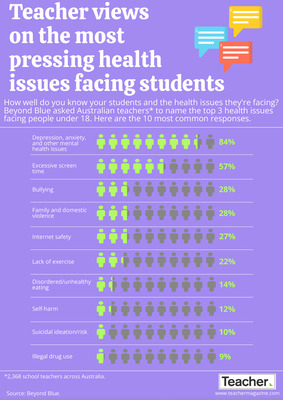
Infographic: Top issues facing young people
Dominique Russell
The latest annual Youth Survey by national charity Mission Australia received responses from 17,480 young people (aged 15-19) around the country on issues important to them in 2024. Here, we look at the top personal challenges they are facing.
-

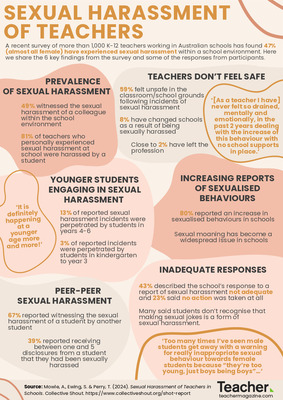
Infographic: Sexual harassment of teachers
Dominique Russell
A recent survey of more than 1,000 K-12 teachers working in Australian schools has found 47% (almost all female) have experienced sexual harassment within a school environment. Here we share the 6 key findings from the survey and some of the responses from participants.
-

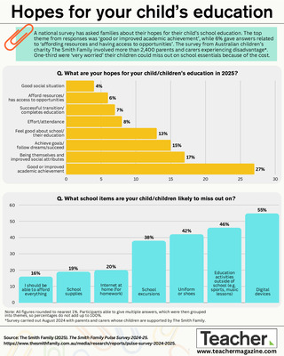
Infographic: Hopes for your child’s education
Jo Earp and Andrew Broadley
A national survey from Australian children’s charity The Smith Family has asked families about their hopes for their child’s school education. The top theme from responses was ‘good or improved academic achievement’, while 6% gave answers related to ‘affording resources and having access to opportunities’. Find out more in this infographic.
-

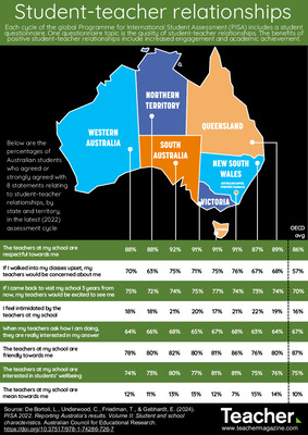
Infographic: PISA 2022 insights – Student-teacher relationships
Jo Earp
One of the topics in the Programme for International Student Assessment (PISA) student questionnaire is the quality of student-teacher relationships. This infographic looks at the responses of Australian students in the 2022 test cycle, by state and territory.
-

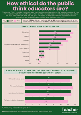
Infographic: How ethical do the public think educators are?
Dominique Russell
The annual Ethics Index by the Governance Institute of Australia measures the population’s overall view of how ethical the behaviour of major sectors is. The education sector continues to be perceived as the most ethical sector. Here, we see 2024 results for all 8 sectors, specific occupations within education, and how public perceptions have changed from 2023.
-

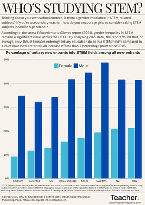
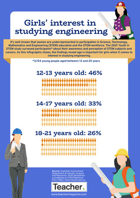
Infographic: Who’s studying STEM?
Andrew Broadley
Thinking about your own school context, is there a gender imbalance in STEM-related subjects? How do you encourage girls to consider taking STEM subjects? In this infographic, we look at gender inequality in students entering tertiary education in a STEM field.
-

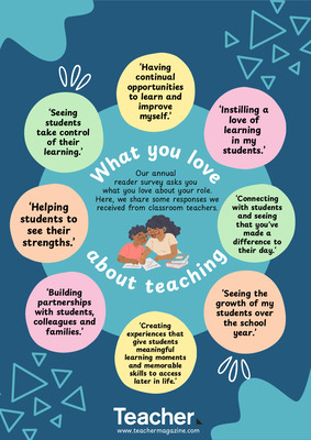
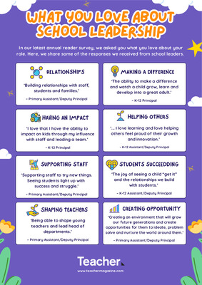
Infographic: What you love about school leadership
Dominique Russell
In our latest annual reader survey, we asked you what you love about your role. In our final infographic for 2024, we share some of the responses we received from school leaders.
-

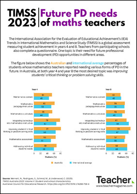
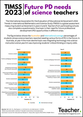
Infographic: TIMSS 2023 snapshot
Jo Earp
Results from the latest cycle of the Trends in International Mathematics and Science Study (TIMSS 2023) have just been released. Today’s infographic looks at the year 4 and year 8 mean scores in mathematics and science for students in Australia and selected participating countries.
-

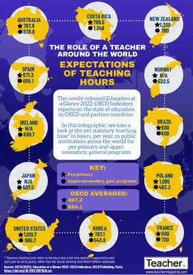
Infographic: Teaching hours around the world
Andrew Broadley
How many hours do you spend teaching each year? How do you think it compares to your peers in Poland, Korea, or New Zealand? In today’s infographic, we share the annual teaching hours of primary and upper secondary teachers in Australia and around the world.
-

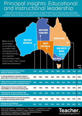
Infographic: PISA 2022 insights – educational and instructional leadership
Jo Earp
The OECD’s Programme for International Student Assessment (PISA) includes a principal questionnaire. Today’s infographic looks at the percentages of principals by Australian state and territory (and the OECD average) who reported participating at least once a week in 7 stated educational and instructional leadership behaviours.
-

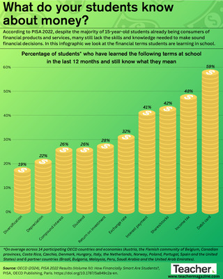
Infographic: What do your students know about money?
Andrew Broadley
According to PISA 2022, despite the majority of 15-year-old students already being consumers of financial products and services, many still lack the skills and knowledge needed to make sound financial decisions. In this infographic we look at the financial terms students are learning in school.
-

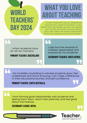
Infographic: World Teacher’s Day 2024 – what you love about teaching
Dominique Russell
Today is World Teacher’s Day in Australia. The annual day is celebrated throughout October across the globe. In our latest annual reader survey, we asked you to tell us what you love about your role, and in this infographic, we share some responses from our readers around the world.
-

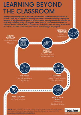
Infographic: Learning beyond the classroom
Dominique Russell
When you’re planning a unit of work for your students, there may be opportunities to include a local trip to support the learning outcomes. Recent research from ACER shows the most popular local learning destinations in Australia and New Zealand for some schools participating in Children’s University, a program designed to engage students aged 5-18 in out-of-school learning enrichment activities.
-

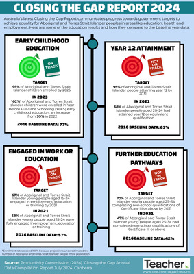
Infographic: Closing the Gap Report 2024
Dominique Russell
Australia's latest Closing the Gap Report communicates progress towards government targets to achieve equality for Aboriginal and Torres Strait Islander peoples in areas like education, health and employment. Here are some of the education results and how they compare to the baseline year data.
-

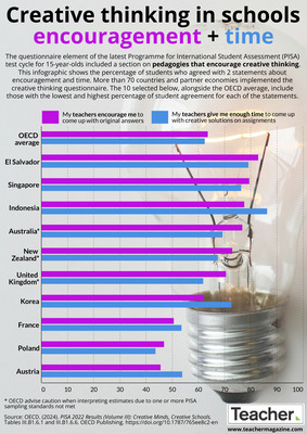
Infographic: Creative thinking in classrooms – encouragement + time
Jo Earp
Do you encourage your students to come up with original answers? Do you also give them enough time to be creative in assignments? Our latest infographic looks at data from the PISA 2022 creative thinking questionnaire. We look at 10 of the participating countries and economies, and the percentage of students who agreed with the 2 statements about encouragement and time.
-

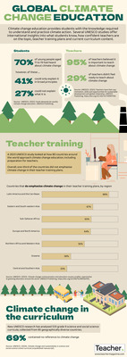
Infographic: Climate change education around the world
Max Hughes
Climate change education provides students with the knowledge required to understand and practice climate action. Several UNESCO studies offer international insights into what students know, how confident teachers are on the topic, teacher training plans and current curriculum content. Find out more in this infographic.
-

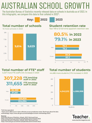
Infographic: Australian school growth
Dominique Russell
The annual Australian Bureau of Statistics (ABS) report on the number of schools, students and staff across Australia in 2023 has been released. In this infographic, we look at some of the latest figures and compare them to the same figures recorded for 2022.