

Infographics from ACER's Teacher magazine.
-

Infographic: Careers education in secondary schools
Jo Earp
New research from the UK has explored the impact of extra careers talks by employers on secondary students' motivation to study, achievement, and their career plans and anticipated pathways.
-

Infographic: Teacher status around the world
Jo Earp
A global survey asked members of the public in 35 countries about their attitudes to teachers and teaching, with data used to create a ‘status index’ score out of 100. Today’s infographic looks at the 15 countries where teachers are most valued, according to their score.
-

Infographic: Out-of-field Maths teaching
Dominique Russell
A report released by the Australian Mathematical Sciences Institute has revealed the chance of students in Australia in Years 7-10 being taught Mathematics by an out-of-field teacher. In this infographic, we look at the findings.
-

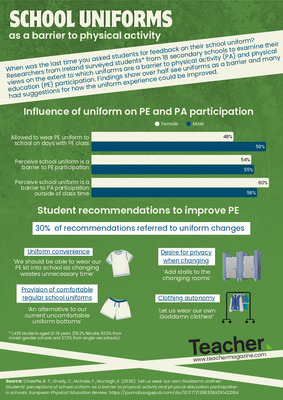
Infographic: Physical activity in schools
Dominique Russell
A new report looks at the levels of physical activity among children and young people across the world. Grades were assigned to a number of indicators which influence physical activity.
-

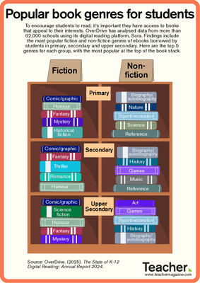
Infographic: Top borrowed picture books
Dominique Russell
Each year, a list of the top 10 most borrowed picture books in Australia is released by the Civica Libraries Index. See which picture books made the list for 2018 in today’s infographic.
-

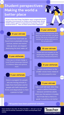
Infographic: What do students want from school?
Jo Earp
To mark World Children's Day, UNICEF Australia commissioned a national survey of secondary students to gather their views about the education system. What would they like to learn more of? What don’t they like about school? Find out in today’s infographic.
-

Infographic: Student motivation in schooling
Jo Earp
In a UNICEF Australia national survey, secondary students were asked for their views about the education system. What aspects of school do they feel positive about? What motivates them to succeed? Find out in today’s infographic.
-

Infographic: ICT Literacy of students
Dominique Russell
Every three years, a sample of Year 6 and Year 10 students in Australia are assessed on their ICT Literacy. In this infographic, we look at the results from the most recent test cycle and how they compare to previous years.
-

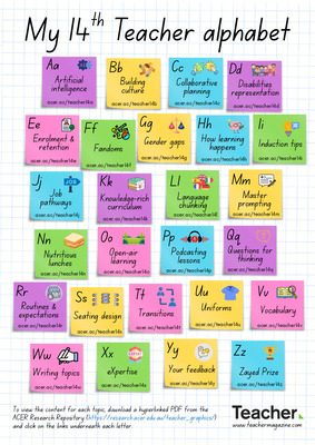
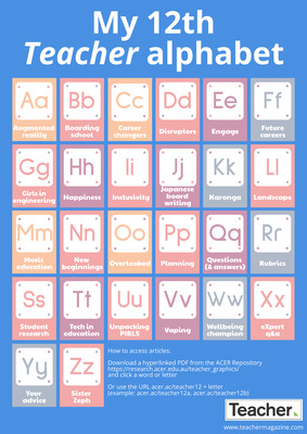
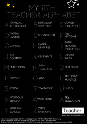
Infographic: My fifth Teacher alphabet
Jo Earp
What do you need information on? Job interview tips? Report writing? Practical science experiments? High frequency words? The fifth Teacher alphabet brings you quick links to popular content that you might find useful.
-

Infographic: Student anxiety
Jo Earp
Schoolwork-related anxiety and test anxiety have a negative impact on student academic performance and wellbeing. The 2015 Programme for International Student Assessment (PISA) surveyed 15-year-olds about schoolwork-related anxiety.
-

Infographic: Preparing students for the future workplace
Dominique Russell
A recent survey asked for people’s views on education in Australia and how they thought it was preparing students for the future workplace. In this infographic, we look at the responses to some of the survey questions.
-

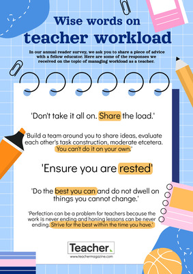
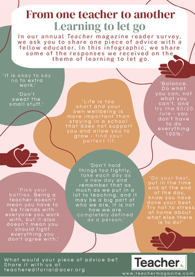
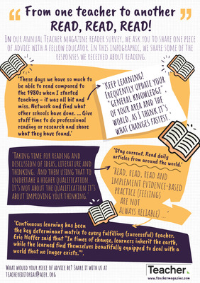
Infographic: Educators share advice on communication
Dominique Russell
The 2018 Teacher reader survey asked educators to share a piece of advice with their peers. One of the topics to emerge was communication. In this infographic, we look at some of your responses on the theme.
-

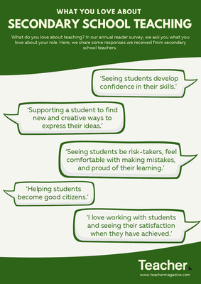
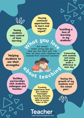
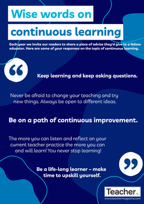
Infographic: Wise words on change
Dominique Russell
Our annual reader survey is open now and we’re asking educators: ‘If you could share one piece of advice with your peers, what would it be?’ One of the themes to emerge is ‘change’. Here are some of the responses we’ve received so far on the topic.
-

Infographic: Teacher training in student career guidance
Dominique Russell
In a new working paper published by the OECD, results from a survey of teachers conducted in PISA 2015 are presented. Teachers were asked if training in student career guidance and counselling was included in their initial teacher education or in their professional development activities during the last 12 months.
-

Infographic: High frequency words used by young students in Australia
Dominique Russell
New research explores the words most frequently written by students in Australia in their first three years of schooling. Today’s infographic looks at the words that were written at a high frequency, unique to each year level.
-
")
Infographic: Reading achievement, hunger and tiredness
Australian Council for Educational Research (ACER)
In PIRLS 2016 (the Progress in International Reading Literacy Study), students were asked about behaviours that could limit reading instruction. This infographic takes a look at some of the results for students arriving at school feeling hungry and tired.
-
")
Infographic: Reading achievement and student absenteeism
Australian Council for Educational Research (ACER)
In PIRLS 2016 (the Progress in International Reading Literacy Study), students were asked about behaviours that could limit reading instruction. Today’s infographic takes a look at some of the results for absenteeism.
-

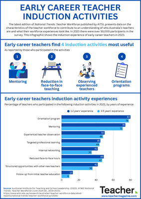
Infographic: The career intentions of early career teachers
Jo Earp
The latest Australian Institute for Teaching and School Leadership (AITSL) report on initial teacher education includes survey data about the career intentions of teachers with one to five years' teaching experience.
-

Infographic: Student relationships with their teachers and peers
Dominique Russell
The Western Australian Government recently surveyed 1812 students across Years 3 to 12 on student engagement. In this infographic, we look at some of the results of this survey, particularly on student relationships with their teachers and classmates.
-

Infographic: Indicators of student engagement
Dominique Russell
The Western Australian Government recently surveyed 1812 students across Years 3 to 12 on student engagement. Here, we look at some of the results of this survey for students in Years 7 to 12.
-

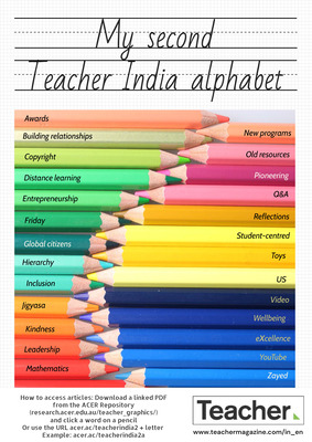
Infographic: My fourth Teacher alphabet
Dominique Russell
What do you need information on? Entrepreneurship? Vocabulary? Attendance? The fourth Teacher alphabet brings you quick links to popular content that you might find useful.
-

Infographic: Collaborative problem solving
Dominique Russell
The most recent OECD Programme for International Student Assessment (PISA) examines student ability in collaborative problem solving. Today's infographic shows the results from some of the 50+ participating countries.
-

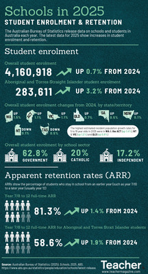
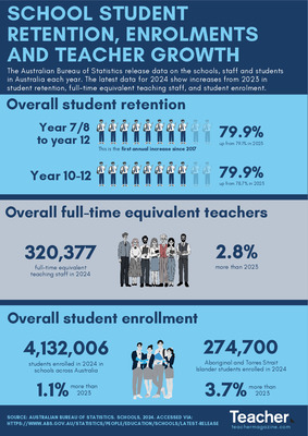
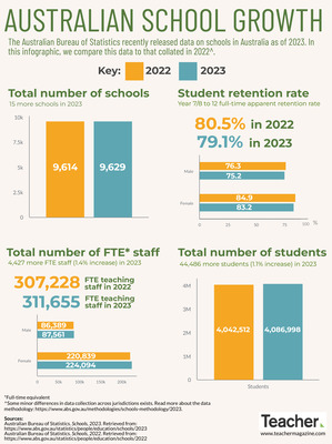
Infographic: Schools Australia data
Dominique Russell
The annual Australian Bureau of Statistics (ABS) report on the number of schools, students and staff across Australia has been released. In this infographic, we look at some of the latest figures.
-
")
NAPLAN Reading: the Achievement Spread
Australian Council for Educational Research (ACER)
Research shows that in Australia the most advanced 10 per cent of students in a year level are about five to six years ahead of the least advanced 10 per cent. This graph shows approximate distributions of students in NAPLAN Reading.
-

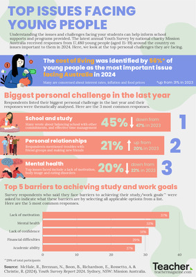
Infographic: Personal concerns of young Australians
Dominique Russell
In the 2017 Youth Survey conducted by Mission Australia, respondents were asked how troubled they are by a series of topics. Here are some of the results, which show a particular struggle with mental health.